About the project
This project consists of two main dashboards: The Requisition Report and the Candidates Report.
The Requisition Report provides a breakdown of job requisitions by their current status and average approval times across different regions.
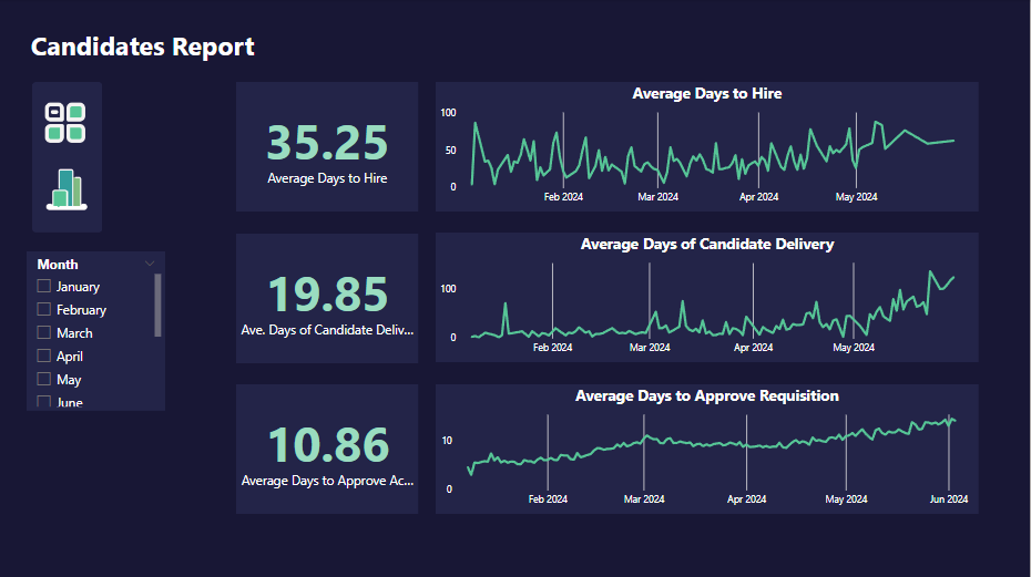
The Candidates Report offers insights into the candidate pipeline, including key recruitment metrics, applicant activity trends, average number of openings per requisition, and the number of candidates per status.
These dashboards serve as a powerful tool for tracking and analyzing recruitment metrics, aiding in data-driven decision-making in the recruitment process.
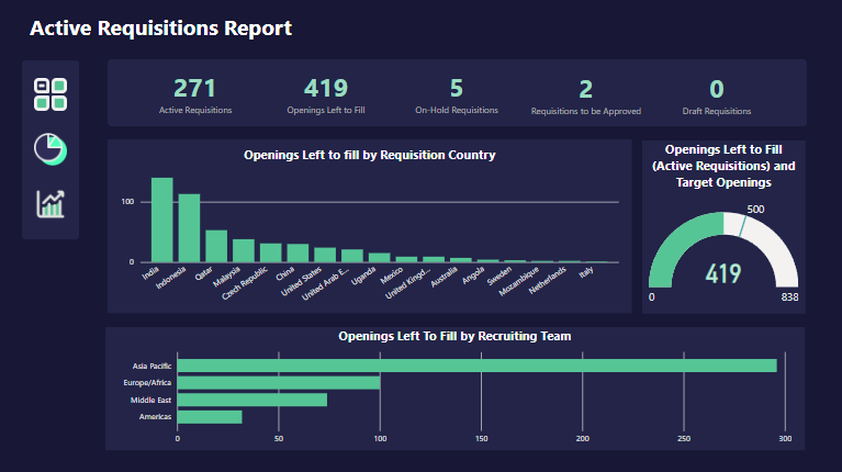
Dashboard Summary: Requisition Report Breakdown
The dashboard is divided into two main sections:
-
Key Metrics: On the left side, there are four panels displaying key metrics related to job requisitions:
- Total Applicants: This metric shows the total number of applicants for all requisitions.
- Total Requisitions: This represents the total number of job requisitions.
- Average CVs Submitted: This indicates the average number of CVs submitted per requisition.
- Unique Requisitions: This shows the number of unique job requisitions.
-
Trends and Analysis: On the right side, there are three line graphs providing a temporal view of applicant activity:
- Active Applicants: This graph shows the trend of active applicants over time.
- Total Applicants (Active Requisitions): This graph displays the total number of applicants for active requisitions over time.
- Rejected Applicants: This graph illustrates the trend of rejected applicants over time.
Each of these line graphs is accompanied by a bar graph below it, providing a more detailed breakdown of the data by region (e.g., Asia Pacific, Middle East & Africa, etc.).
This dashboard is a powerful tool for tracking and analyzing recruitment metrics. It allows for quick visualization of trends in applicant activity and rejection rates across different regions, which can be invaluable for making data-driven decisions in the recruitment process. As a data analyst, you could highlight how this dashboard can help identify bottlenecks in the hiring process, optimize resource allocation, and ultimately improve the efficiency and effectiveness of recruitment efforts.
-
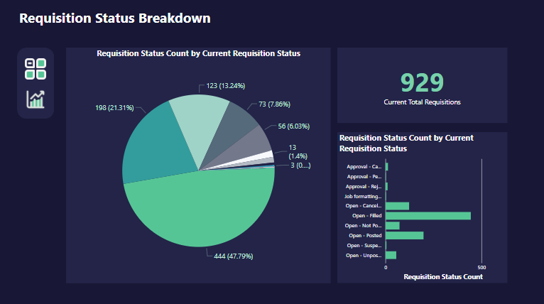
Pie Chart: On the left side of the dashboard, there’s a pie chart that represents various requisition statuses. These include “Approved,” “Cancelled,” “Open - Cancelled,” “Open - Filled,” “Open - Not Filled,” and “Open - Withdrawn.” Each status is represented by a different color and is associated with a number and percentage out of the total 929 current total requisitions.
-
Total Requisitions: On the right side of the pie chart, the total number of current requisitions is prominently displayed as 929.
-
Bar Graph: Next to the total requisitions, there’s a vertical bar graph displaying counts for each status category. The bars are color-coded to match those in the pie chart.
This dashboard provides a clear and concise view of the current status of all requisitions, making it easy to understand the distribution of different statuses at a glance. It would be particularly useful for tracking the progress of requisitions and identifying any potential bottlenecks or areas for improvement in the requisition process.
-
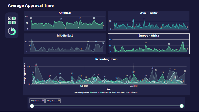
Title: The page is titled “Average Approval Times,” indicating that it focuses on the average time it takes for requisitions to be approved.
-
Line Graphs: The dashboard features four separate line graphs, each representing different geographical regions: Americas, Asia-Pacific, Middle East, and Europe-Africa. Each graph shows fluctuations in approval times over a period from January 2023 to March 2024.
-
Color Coding: The graphs are color-coded to differentiate between the Recruiting Team (light blue), Americas (dark blue), Asia-Pacific (green), Europe-Africa (purple), and Middle East (teal). There’s a legend below the graphs indicating these color codes.
This dashboard provides a clear and concise view of how approval times vary across different regions and teams over time. It would be particularly useful for tracking the efficiency of the approval process and identifying any potential bottlenecks or areas for improvement.
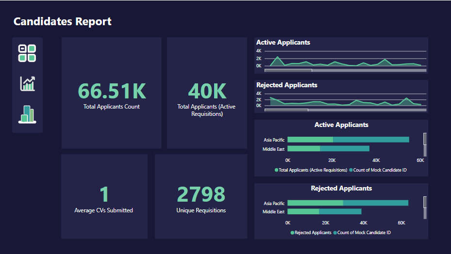
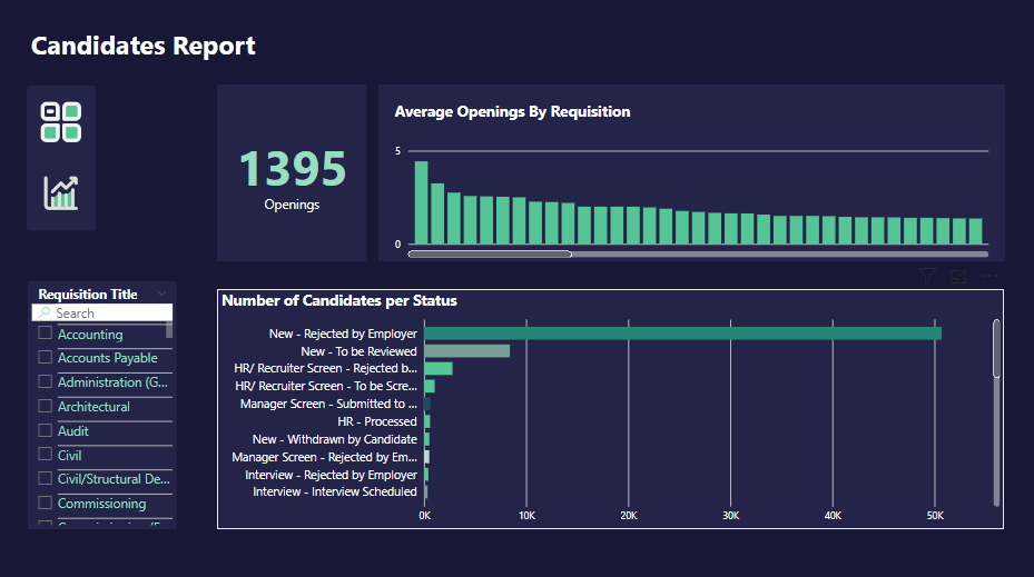
Dashboard Summary: Candidates Report Breakdown
The dashboard includes various data visualizations related to job applicants. It provides insights into the hiring process through bar graphs and numerical data. Here are the key components:
-
Total Applicants: This metric shows the total number of
applicants for all requisitions.
-
Average CVs Submitted: This indicates the average number of CVs submitted per requisition.
-
Unique Registrations: This shows the number of unique job requisitions.
-
Rejected Applicants: This section provides a breakdown of the number of rejected applicants categorized by region.
These metrics provide a comprehensive view of the recruitment performance of an organization. They allow for quick visualization of trends in applicant activity and rejection rates across different regions, which can be invaluable for making data-driven decisions in the recruitment process.
-
Pie Chart: On the left side of the dashboard, there’s a pie chart that represents various requisition statuses. Each status is represented by a different color and is associated with a number and percentage out of the total current total requisitions.
-
Total Requisitions: On the right side of the pie chart, the total number of current requisitions.
-
Bar Graph: Next to the total requisitions, there’s a vertical bar graph displaying counts for each status category. The bars are color-coded to match those in the pie chart. The y-axis of this graph ranges from 0 to 500 in increments of 100, while each bar’s height represents the count for that particular status.
This dashboard provides a clear and concise view of the current status of all requisitions, making it easy to understand the distribution of different statuses at a glance. It would be particularly useful for tracking the progress of requisitions and identifying any potential bottlenecks or areas for improvement in the requisition process.
-
Title: The page is titled “Average Approval Times,” indicating that it focuses on the average time it takes for requisitions to be approved.
-
Line Graphs: The dashboard features four separate line graphs, each representing different geographical regions: Americas, Asia-Pacific, Middle East, and Europe-Africa. Each graph shows fluctuations in approval times over a period from January 2023 to March 2024.
-
Color Coding: The graphs are color-coded to differentiate between the Recruiting Team (light blue), Americas (dark blue), Asia-Pacific (green), Europe-Africa (purple), and Middle East (teal). There’s a legend below the graphs indicating these color codes.
This dashboard provides a clear and concise view of how approval times vary across different regions and teams over time. It would be particularly useful for tracking the efficiency of the approval process and identifying any potential bottlenecks or areas for improvement.
Check the repository
This contains the project database and the Power BI file. Click here

Interactive Excel Dashboards: Built for Exploration
This project delves into interactive Excel dashboards. I mastered data prep, crafting insightful visualizations (like Map chart and Line chart). This empowers me to create clear and engaging dashboards for complex data.
Learn more

Tableau Projects
The COVID-19 project involves analyzing and visualizing data related to the pandemic's global impact. Using Tableau, we track key metrics such as total cases, vaccination rates, and death tolls compared to population sizes.
Learn more